


Summit Teas is a brand I created in my first semester at California State University, East Bay. For my senior project I chose to revisit it and completely re-brand it, producing new logomarks and a new brand identity including three tea boxes, a poster, mailable giftcards, stickers, and tea bag tags. For my first foray into packaging and branding, I wanted to create a tea-equivalent to a third-wave coffee company, that would emphasize transparency, high-quality ingredients, and allow consumers to make more conscious decisions in the grocery aisle. Many teas on shelves today contain vague ingredient lists with little to no information about sourcing or how to brew tea properly. I wanted the design of the brand to avoid typical design cliches. I was inspired by topographical, contour maps of regions where tea is grown. Tea can often be seen growing on curving hillsides in mountainous regions. This imagery inspired the abstract lines that feature on the tea boxes. The design was simultaneously an homage to where and how tea is cultivated, and to serve the double purpose of differentiating it from competitors.
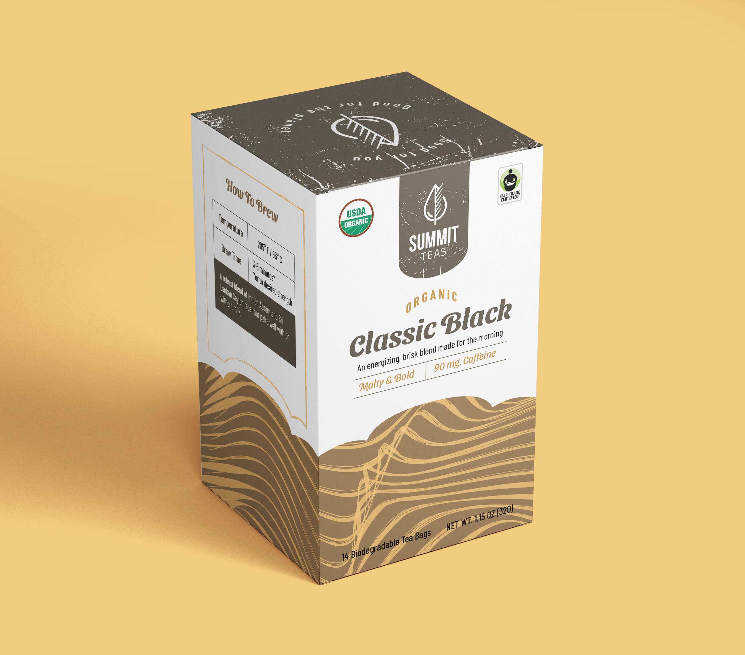


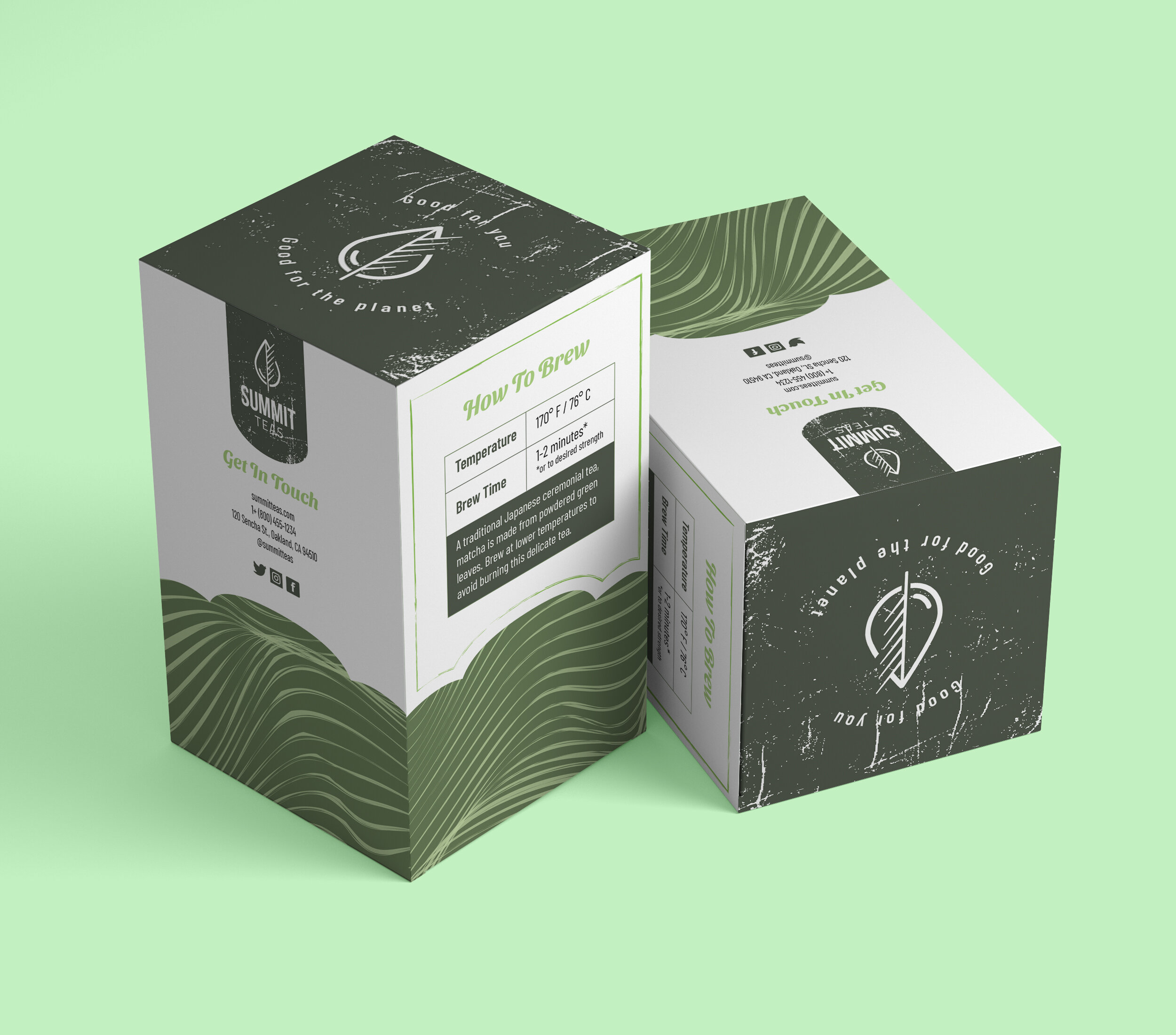
The Tea Boxes
The three boxes I designed for this project were created around three different types of tea: a Genmaicha green tea, a Classic Black tea blend, and a Rooibos. They feature the abstract contour line design with slight variations among each box. The color schemes are individually inspired by the colors of the brewed teas.
The front panel includes the prominent logotype, the tea name, a short descriptive sentence, caffeine content, flavors notes, and non-gmo and organic stickers. The back panel contains the Summit Teas company bio.
The side panels have information on brewing each type of tea, from correct water temperature and steep time to a bit more background on the tea themselves. They have company contact information and relevant social media icons for consumers to easily find and follow Summit Teas.
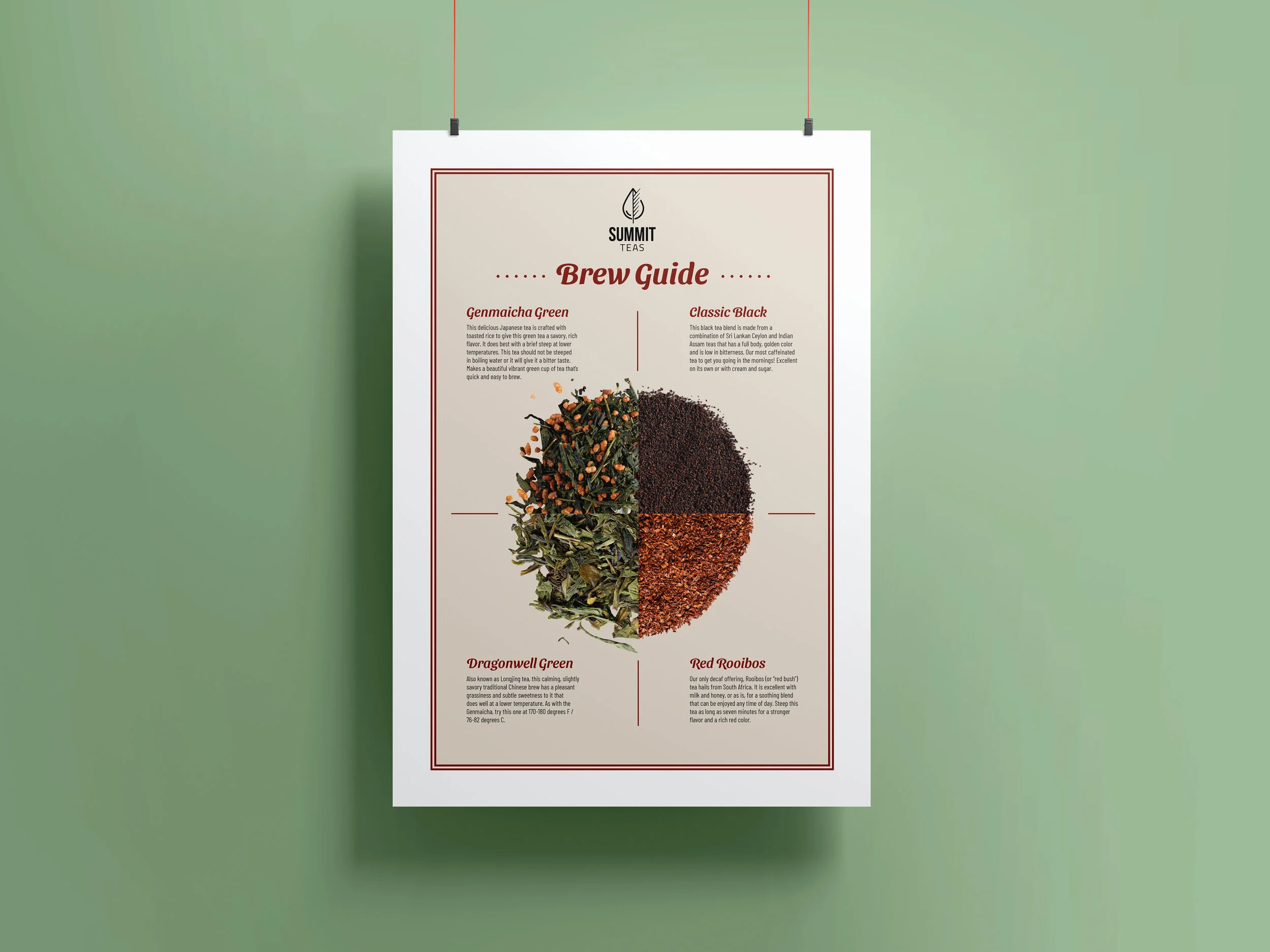
The Poster
For the poster I wanted to maximize the amount of space I had for more in-depth information on the teas the brand could offer. I decided rather than photograph four separate images of the loose-leaf teas and arrange them independently of one another, I could save space and create a more interesting layout by cropping them into fourths, with each section corresponding to a type of tea.
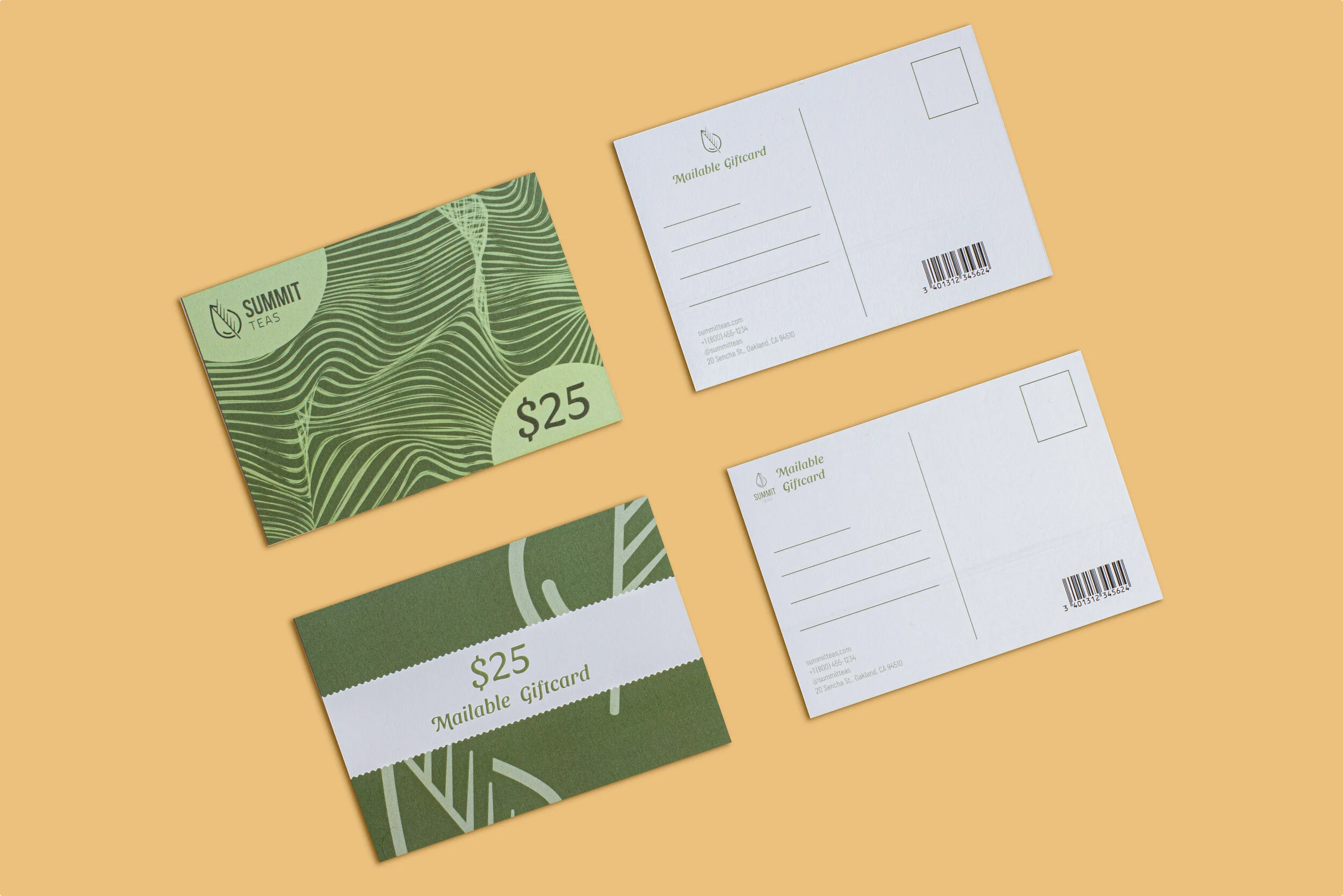
The Giftcard Postcard
I wanted to try out an unconventional giftcard format, in the form of a mailable postcard. I designed two different versions that are standard 2.5 x 5 in. size. I kept the back design quite restrained, as there needed to be plenty of space for a customer to write both message and address, and a place for the stamp as well.
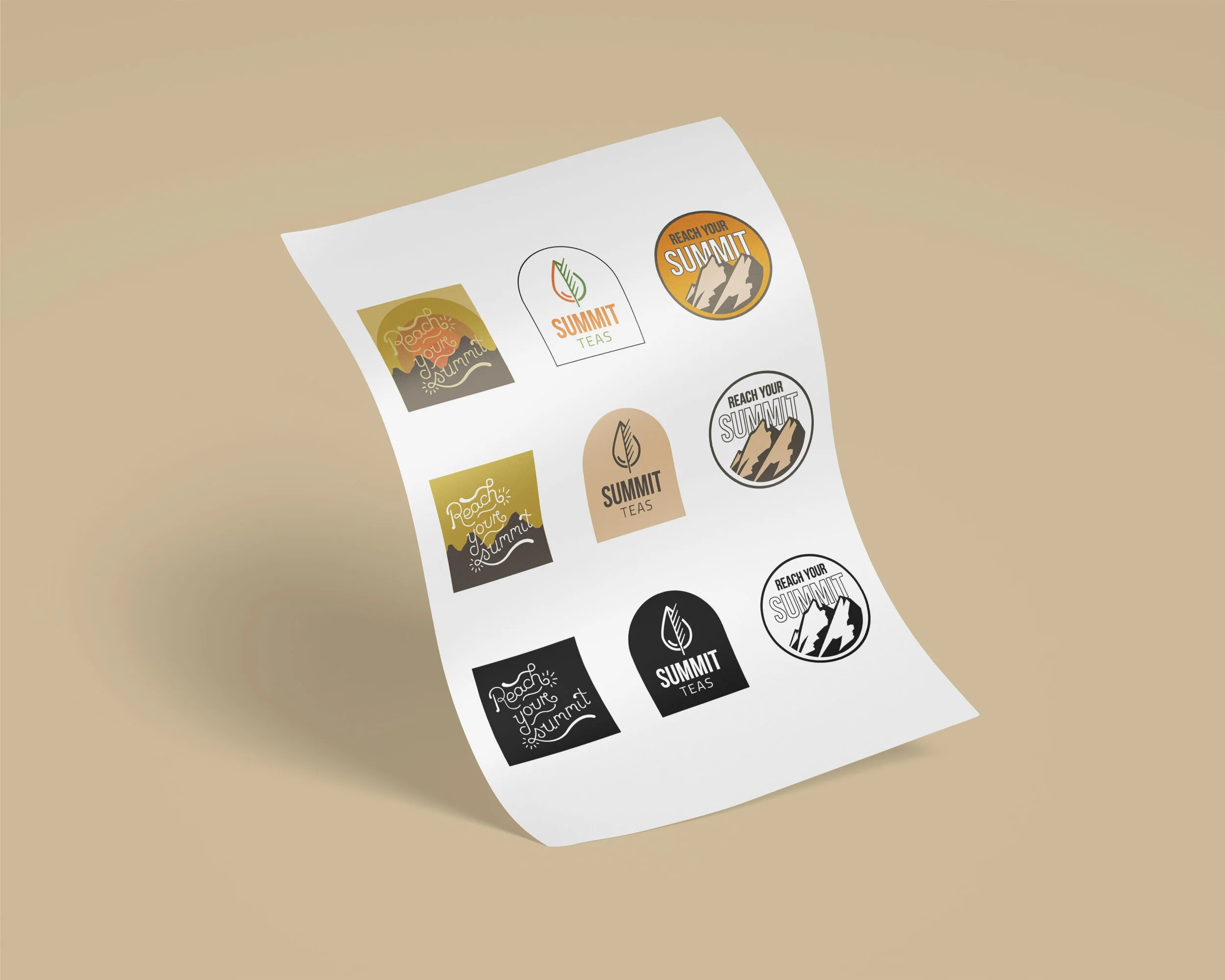
The Stickers
The stickers I made in order to offer some merchandising for the brand that would offer it a playful aesthetic, based around the slogan “reach your summit.” One design features the logotype, the other the slogan and a mountain design, and the third I incorporated some graphics with hand-lettering that I then vectorized and cleaned up to produce the final result you see above.