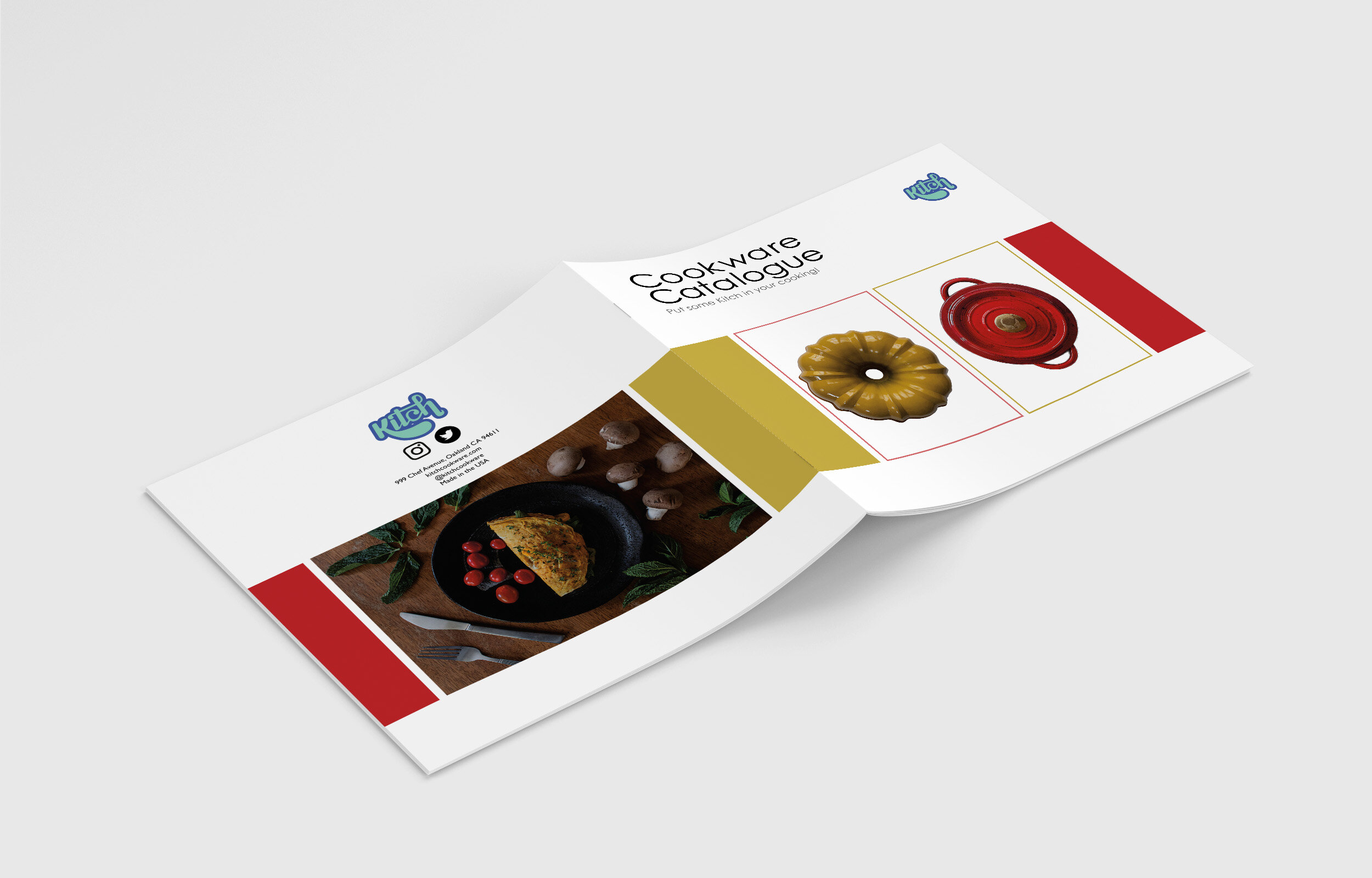
Kitch was a project I completed in 2020 in which I was provided with the name of a fictional cookware company, called Kitch. The first step in the process involved me going through a number of handlettering iterations of the company name to develop a logotype which I then digitized and can be seen on the front cover of the magazine. I wanted this brand and the deliverable to have a playful, invigorating aesthetic, based around the connotation behind the name, but with a more positive spin on it.
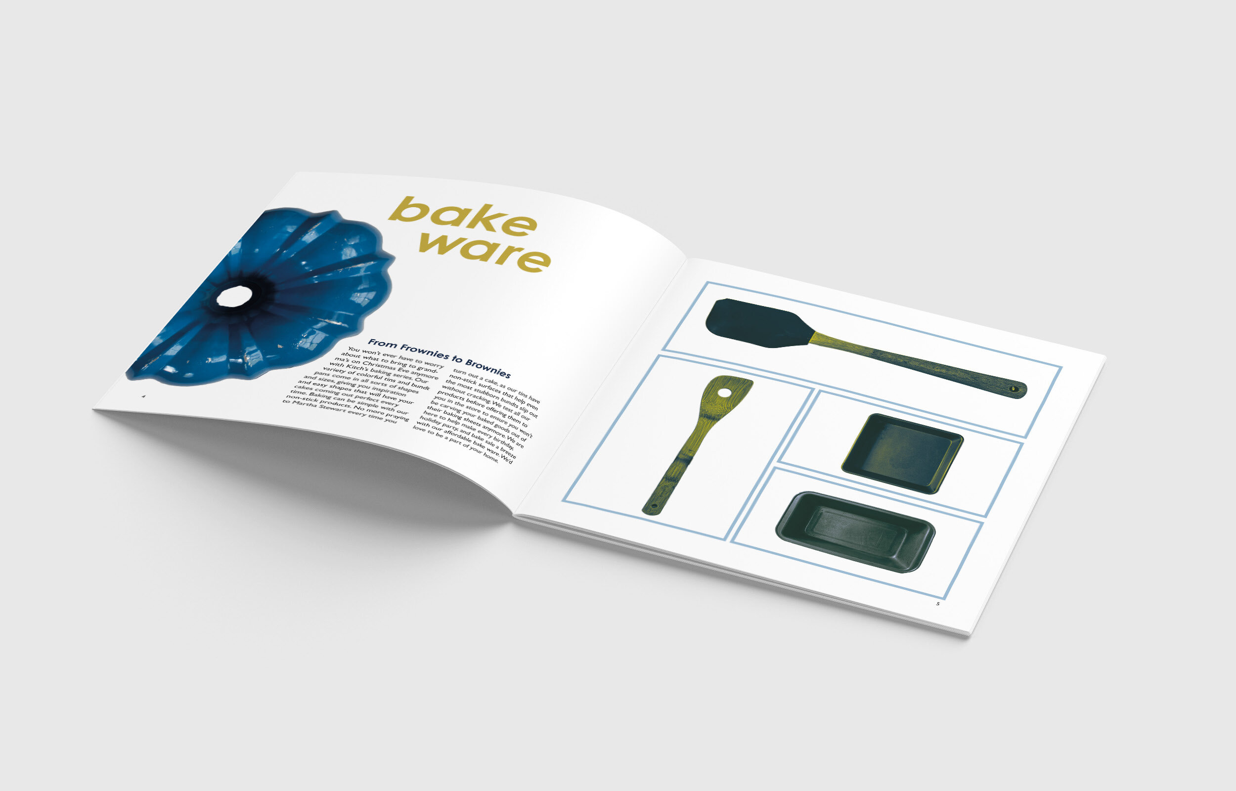
I utilized duotone effects on many of the images that I sourced from three cookware pieces in particular: a blue bundt pan, a red cast iron pot, and a rolling pin. I played around with typographic positioning on the pages with written copy using the “chapter” titles to again reinforce the playfulness of the brand. I used what I learned of food photography to stage the images on the first interior page, as well as the back cover image. I edited and cleaned up each cookware piece that I photographed, as well as came up with all of the slogans and body text.
The research I conducted on who might be the target audience for a cookware magazine lead me to the friendly, playful concept behind the brand and subsequent magazine styling. I believe my design choices supported the concepts behind them, and I was pleased with the end results!